
Brain Stream Australia · working notes, added as questions come up
Practical notes on product design and build
These are working notes rather than thought leadership. Things we have learned building apps, websites and stores for Australian clients, written for people making decisions about a product rather than people browsing a portfolio. New pieces are added as questions come up repeatedly in project conversations.
Designing for the small screen
What changes when the phone comes first, and how that ordering survives all the way into the build.
Accessibility as real work
WCAG requirements, what they touch in a project, and why the wireframe stage is the cheap moment to handle them.
Choosing tools and partners
Design systems, handoff files, no-code against custom builds, and what to listen for when a studio answers.
Mobile-first design: what it actually changes
Mobile-first is not about shrinking a desktop layout. It forces a decision about what matters most, because a phone screen will not hold everything. When you design for the smallest viewport first, you rank content by importance and you cut what does not earn its place.
Working the other direction tends to produce layouts that technically stack on a phone but bury the primary action below three sections of context. Start small, then add for larger screens. On a recent store build the checkout button sat four scrolls down on a phone and one tap away on desktop; moving it up on the small screen changed how people finished an order.
In practice it shows up early. We sketch the phone screens before any desktop artboard exists, agree the order of information with whoever owns the content, and only then widen the layout. If a section cannot justify itself on a narrow screen, it usually cannot justify itself anywhere.

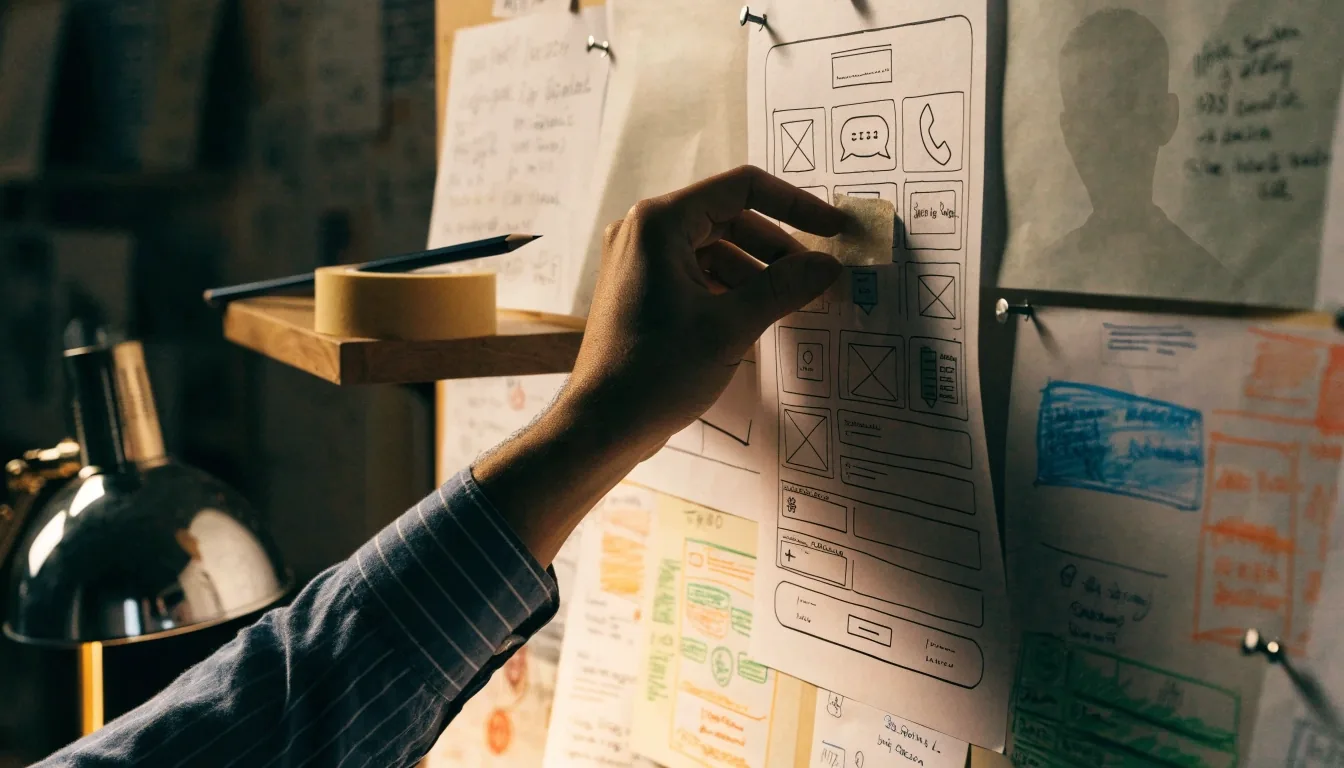
Sketched on the smallest screen first, at 9pm, with the lamp on.
Accessibility requirements and how they change the work
WCAG is the standard most Australian organisations get measured against, and it shows up in audits and procurement documents. Its four principles — perceivable, operable, understandable and robust — translate into concrete requirements: contrast ratios on every text and control, keyboard access to every interactive element, form errors announced to assistive technology, and a heading structure that reflects the page rather than the visual size of the text.
Contrast and type
Body text, small labels and every button state get measured against the surface they sit on. Light ink on a busy photograph does not pass, however good it looks in a mockup.
Keyboard and focus
Every control must be reachable and visibly focused without a mouse, and the focus order has to follow the reading order of the page.
Structure and errors
Headings describe the page, not the font size. Form errors are written so a screen reader announces what went wrong and what to do next.
Building to these from the wireframe stage is cheap. Retrofitting them after launch touches design, content and code at once, and the cost lands on the client rather than the studio. If accessibility is part of your procurement, put the requirements in the brief before the first screen is drawn.
When a design system is worth building
A design system pays off when a product will be maintained for years by more than one person. If you are shipping a small site and moving on, a component library is overhead. If you have three teams building screens from different mockups, it is the only way to stop drift. The practical test: count how many times the same button gets redesigned in a year. If the answer is more than once, you probably need one.
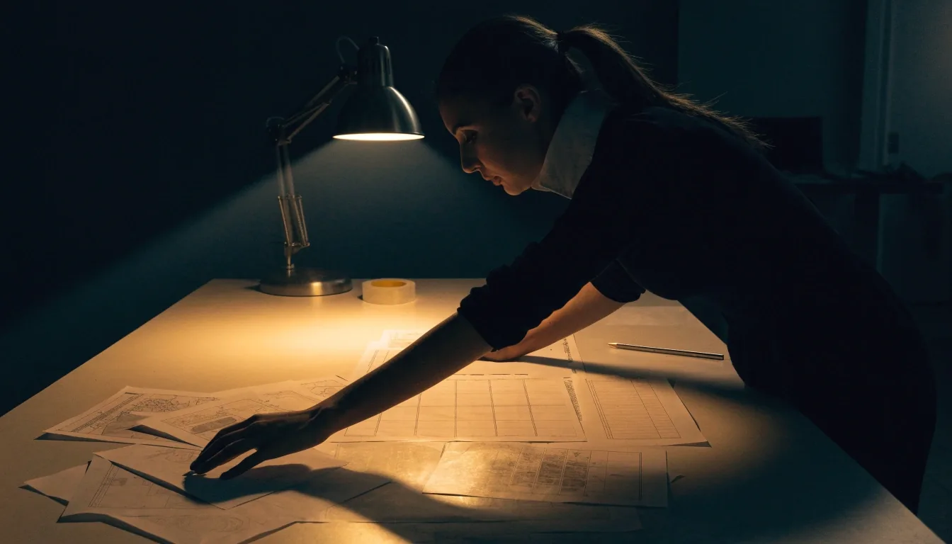
The component inventory, before anything is named
Figma handoff: why files fail developers
Most handoff problems come from files that show a screen but not its states. Developers need to know what a button looks like when it is loading, disabled, or focused, and what happens when a form fails. They need named components rather than loose rectangles, and spacing defined as tokens rather than eyeballed. Dev Mode helps by letting developers inspect values directly, but the file still has to be built with that use in mind. Designers who name their layers save their teams days.
Custom build or no-code: a decision framework
Three questions settle most of these cases. How unusual are your requirements? How quickly do you need to launch? Who maintains the site in year two?
- Standard requirements, fast launch, non-technical content team no-code platform
- Custom logic, integrations and performance requirements custom build
- Nobody on staff will touch the site after launch simpler platform
The failures we see come from choosing the tool before understanding the problem, usually with an optimistic view of how much will change later.
Choosing a UX/UI partner in Australia
Credible studios will talk about constraints and trade-offs. Studios that only talk about outcomes are usually skipping the part that matters.
A question worth asking in the first conversation
Look at how a studio explains its decisions, not just the finished screens. Ask what they would do differently on a past project, and whether they will show you a file rather than a gallery. Ask about accessibility and see whether the answer is specific. Ask who writes the code and who owns it after launch.
The answers tell you more than any portfolio page. A studio that can name the constraint it hit and how it was worked around has done the job before. One that can only describe the result has probably described a render.
React Native, Flutter and native: matching the stack to the product
- React Native one codebase, iOS and Android
- Flutter custom interface first
- Native development platform-specific hardware
None of these is universally correct, and the wrong choice usually shows up around month six, when a requirement arrives that the chosen stack handles badly. Pick the stack against the roadmap you can actually describe, not the one you hope to have.

The stack decision is a roadmap question, not a taste question.
WordPress in 2024 and beyond
WordPress still runs a large share of the web, and for content-heavy business sites it remains a reasonable choice. Editorial control is straightforward, plugin support is broad, and most Australian developers have worked with it.
The trade-offs are real: plugin maintenance, security updates, and performance that depends on how carefully the site was built. It suits teams that will keep publishing. If nobody will touch the site after launch, a simpler platform often serves you better.
Ask the studio who will run the updates before you choose the platform
What public sector design standards teach private teams

Documented rules travel further than good intentions
Write the content rules first
The Australian Government Design System documents components, patterns and content rules in more detail than most commercial design systems bother with. Most inconsistency is a content problem wearing a design costume, so the rules come before the components.
Build accessibility into the component
Accessibility belongs in the component definition, not in a checklist applied at the end. Both habits save money regardless of who you are building for, public or private.
Questions that come up in project conversations
Should accessibility be in the brief or handled at the end? open close
Put it in the brief. Contrast, focus order and heading structure are decisions made at the wireframe stage, and changing them later touches design, content and code together. If a partner cannot tell you which WCAG requirements apply to your product, that is worth noticing early.
How do I know whether I need a design system? open close
Count how many times the same component gets redesigned in a year. More than once, across more than one person, and a shared component library starts paying for itself. A single small site with one maintainer can usually wait.
What should I send a studio before the first call? open close
The problem in plain words, who will maintain the product in year two, and any deadline that is real rather than aspirational. A rough list of what the product must do beats a polished brief. If you already have a design file, send the file, not screenshots of it.
Is a custom build always the better answer? open close
No. Standard requirements, a fast launch and a non-technical content team point toward a no-code platform, and that is often the right call. Custom work earns its cost when the requirements are unusual, the integrations are specific, or performance is part of the product promise.
Bring us the decision you are stuck on
Most of these notes started as a question in a project conversation. If one of them matches something on your desk, send it over and we will answer it directly — no pitch attached.
Monday to Friday, 9:00 AM – 6:00 PM · Suite 1, Shop 1, 7F Parkes Street, Harris Park, NSW 2150